|
|
|
Line Graph
What is it?A line graph represents data or sets of data that have
been collected over a period of time. The data are plotted on a graph
corresponding to standard intervals of time, and a line is drawn
connecting the data points. If updated regularly, line graphs help
managers follow a trend over a period of time and take actions to manage
the trend.
Who uses it?The team, the manager.
Why use it?The line in the graph allows managers or team members
to see trends in the data (an increase, decrease, or no change) over a
period of time. This can be useful to help you visualize changes in the
process over time, or to compare the performance before and after the
implementation of a solution.
When to use it?To visualize a process during a specific period of
time to help you describe a problem, or when you want to evaluate a
solution to a problem.
How to use it:
- Decide on the period for collecting data (for example, 30 days, 12
months, etc.).
- Gather the data. To see a trend, it is generally useful to collect
20 to 25 data points over the time period.
- Draw the vertical line (Y axis) for representing the data. The scale
will depend on the values of the data. (In the example below, the Y axis
represents "number of clients seen in the clinic.") Starting at zero in
the lower left corner, label the marks on the far left vertical line in
increments of 5, 10, 20, or 100.
- Draw the horizontal line (X axis), where each point represents a
period of time. It can be hours, days, weeks, months, etc. (In the
example below, the time frame used is months.)
- Plot the data you have collected over the period of time studied.
Put a dot on the graph to show the value of the data for each time
period your graph will cover. (In the example below, for each month.)
- Connect all the dots that you have plotted on the graph. This will
form a line that shows the trend of the data observed over the period
studied. If you want to continue the process of observation, make a new
dot on the graph for each additional segment of time.
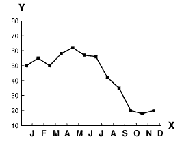
Example:Here is an example of a line
graph being used to describe a problem.
|